Sainsbury’s - Redesigning the Argos, Habitat & Tu Registration, Login & Guest Checkout
Q1 2021 – Q1 2022
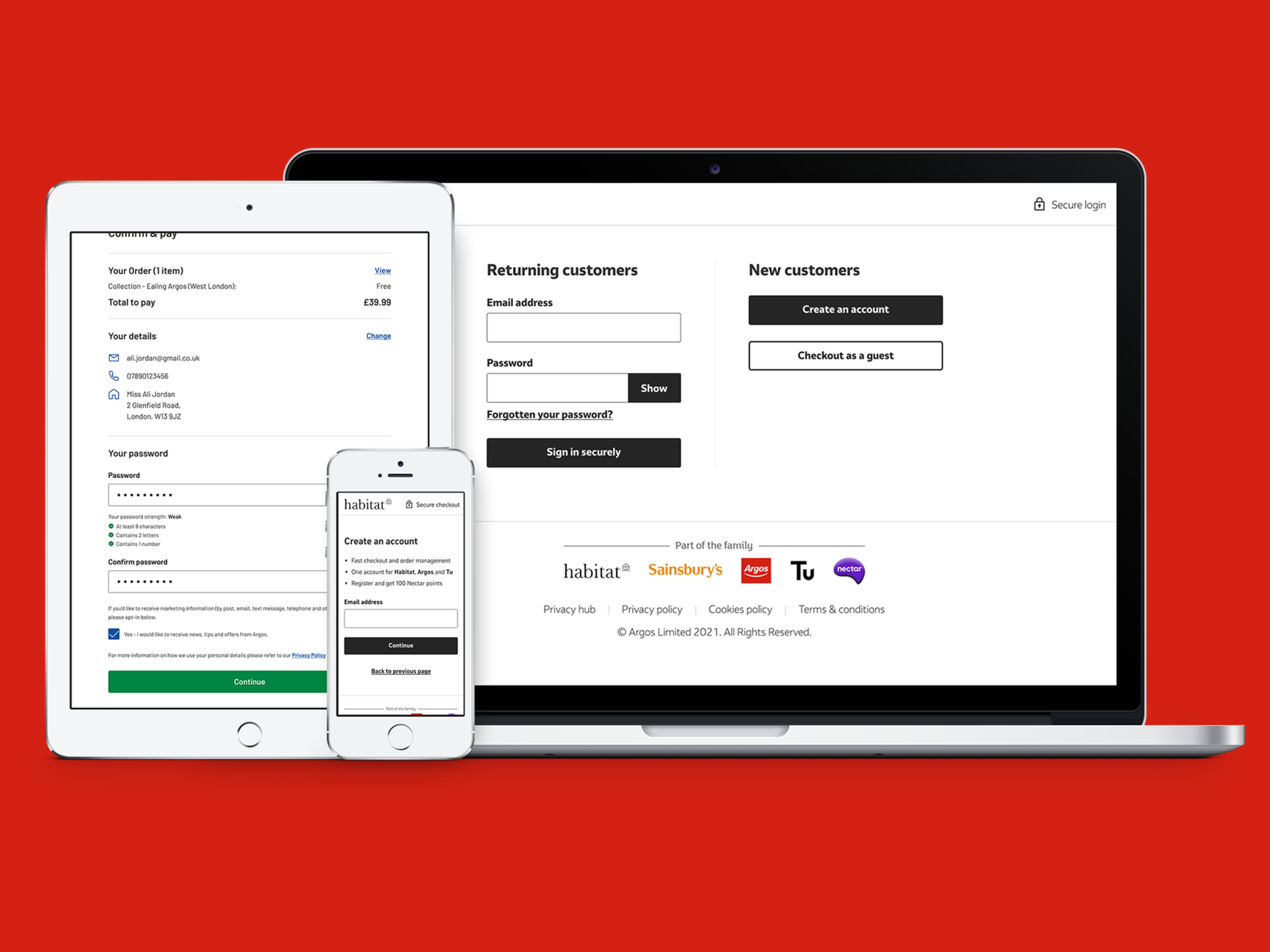
Argos, Habitat, and Tu share a platform serving over 430 million annual site visits. When Habitat migrated onto Argos's infrastructure, guest checkout - a feature Habitat customers had previously relied on - was removed. Before Tu migrated to the same platform, the goal was to restore guest checkout across all three brands, while simultaneously redesigning the registration and login experience that had accumulated years of usability debt.
This was a phased, multi-brand project on a legacy backend with real technical constraints. Not everything we designed shipped on the timeline we planned. What follows is an honest account of the work, the constraints, and what it taught us about designing at enterprise scale.
The Problem
Several distinct problems needed solving simultaneously:
New customers were required to create an account to complete a purchase - a friction point that drove abandonment, particularly for infrequent shoppers who didn't want to manage another login.
The existing registration flow had accumulated usability issues: unclear form headings, redundant data entry including re-typing passwords, accessibility failures on contrast and button sizes, and a mandatory title field that alienated users who didn't identify with the available options.
B2B customers had a specific need - their corporate accounts prevented self-service, requiring a separate pathway that the existing system didn't accommodate cleanly.
Social commerce was growing, driving customers from Instagram and TikTok directly to product pages with an expectation of frictionless checkout - the existing flow was the opposite of frictionless.
The backend constraint shaped everything: we couldn't change the database structure in the first release. Whatever we designed had to work within the existing architecture, using UI to solve problems that ideally would have been fixed at the data layer.
My Role
Lead UX Designer, collaborating with another UX Designer, two Product Managers, and a Tech Lead. Stakeholders from Habitat, Tu, and backend engineering teams were involved throughout.
Process
Discover
We began by mapping the current customer journeys for both registration and login across two distinct entry points: via the header and via the trolley. This mapping exercise identified where customers faced unnecessary decisions, where the flow broke down, and where the design contradicted itself.
I led a heuristic analysis against Nielsen's ten usability principles, identifying the specific failure points in the existing flow. Competitor analysis across John Lewis, H&M, Etsy, and Selfridges gave us a benchmark for where Argos sat relative to industry standards - and it wasn't flattering.
We supplemented our own analysis with Baymard Institute research on e-commerce checkout usability, one of the most comprehensive bodies of evidence available on exactly this type of problem. Their data on forced account creation and guest checkout abandonment was directly applicable and gave us external validation for the design direction we were already leaning toward.
I led four usability studies with 22 participants across the existing registration and sign-in flows, pinpointing the specific moments where users lost confidence or gave up entirely.


Define
The research synthesis produced a clear hierarchy of problems:
Guest checkout wasn't a nice-to-have - for a significant portion of customers, particularly infrequent shoppers and those making one-off purchases, forced account creation was the primary reason they abandoned. The data was unambiguous on this.
Account creation friction was compounding. It wasn't one problem - it was the combination of mandatory title, password complexity requirements with no inline validation, re-entry of data already provided, and marketing preference presentation that confused rather than informed.
The title field deserved its own note. We identified it as both a usability issue and an inclusivity failure - forcing customers to select Mr, Mrs, Miss, or Ms excluded non-binary customers and felt outdated in 2021. We recommended making it optional. The backend constraint meant this couldn't be addressed in the first release. Looking at the current Argos registration page today, the title field remains mandatory - evidence that some backend constraints outlast even the best design arguments.
We defined success metrics across the project: conversion rate for logged-in and guest users, exit rates during sign-in and checkout, time spent on checkout, CSAT scores, Nectar usage, and order fraud rates. Defining these upfront ensured we had a shared language with stakeholders about what we were trying to move.


Develop
The registration, login, and guest checkout screens went through eight design variations, each tested against key performance indicators: time on task, ease of use, click counts, and error rates across desktop and mobile.
Two specific design decisions went through the most iteration. First, the placement of the guest checkout option - we tested it at the start of checkout, at the order confirmation stage, and as part of the checkout flow itself, measuring which placement drove the highest completion rates without cannibalising account creation. Second, the layout of order summaries during checkout - right-hand placement versus header placement, testing which provided clarity without adding cognitive load to the payment decision.
We used UserZoom for end-to-end research, evaluating the final designs across all possible paths - product page through to order completion, for both delivery and in-store collection. This included Pay@Browse, the in-store tablet terminals used as digital catalogues - a surface that required the design to work across six distinct breakpoints, from large in-store tablet to mobile, ensuring the experience was consistent regardless of how a customer entered the checkout.

Deliver
64 talk-out-loud sessions and 2,152 unmoderated surveys informed the final iteration of micro-copy and interaction details. These sessions surfaced specific anxieties that hadn't appeared in earlier testing - customers questioning why their phone number was being collected, and wanting reassurance about data security before completing registration. Both were addressed through copy changes rather than structural redesign.
The project rolled out in phases: Pay@Browse first, then progressive register in checkout, then guest checkout. Phasing was a deliberate choice on a platform this complex - it allowed us to measure the impact of each change before committing to the next, and gave engineering time to address the backend dependencies that made some features harder to build than to design.

Outcome
The guest checkout experience is live on Argos today - the feature that prompted this entire project is now in place for customers across all three brands.
What didn't resolve cleanly in the first release has since partially resolved. The title field now includes Mx - the inclusivity recommendation we made in 2021 eventually landed, even after we'd left. The field itself remains mandatory, which was the other half of the recommendation, and the backend constraint that prevented making it optional is visibly still in place today.
That's not a failure of the design process - it's an accurate reflection of how change happens inside organisations with complex legacy infrastructure. We identified the problem, made the recommendation, documented the constraint, and designed around it as best we could within the first release. Some things take longer than a single project cycle to fix. The fact that Mx is now there at all is evidence that design advocacy can outlast your tenure if you document it clearly enough.
The research process itself was the most rigorous I'd run at that point: 64 talk-out-loud sessions and 2,152 unmoderated surveys across a platform with over 430 million annual visits. The scale of the research was proportionate to the scale of the risk - a broken registration flow on a platform this size has material commercial consequences.
Key learnings
Designing at enterprise scale means accepting that the right answer and the currently buildable answer are sometimes different things. The job is to document the gap clearly enough that someone fixes it eventually - and to make the currently buildable answer as good as it can be in the meantime.
Marketing preference presentation during registration deserves more attention than it typically gets. Users consistently confused opt-in language for mandatory data collection, leading to drop-off at a point where they'd already invested time in the form. This is a broader pattern in e-commerce that Argos wasn't alone in getting wrong.
The order confirmation page was cluttered in ways that undermined the sense of completion customers needed. We flagged it as an area for future refinement - it remains on the backlog.