Sofar Content Pages
Sofar Sounds aimed to expand beyond its core ticketing journey and become a hub for music discovery. Part of this initiative involved redesigning various content pages across the site, including the Blog, Host & Artist application pages, and the How It Works page. This project focused on improving both the user experience and the site’s engagement potential through these content pages.
Date: Q3 2018 - Q4 2018
Lead Product Designer: Alex Dawson
Blog Redesign
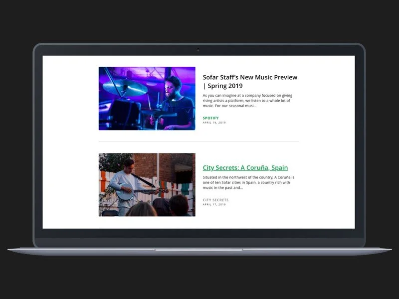
Sofar Sounds’ existing blog was designed quickly by a Product Manager and Engineer, with no UX considerations. As a result, it suffered from high bounce rates, low readership, and accessibility issues. The content was underperforming, and the page layout did not encourage deeper exploration. Additionally, the Brand team, responsible for the blog content, needed more flexibility to drive engagement and improve the site’s performance.
Problem
High bounce rates due to poor user engagement.
Low content discovery as articles weren’t effectively structured or surfaced.
Accessibility issues impacting a broader audience.
Limited functionality for the Brand team to enhance posts with multimedia or social elements.
Users & Audience
The blog served a global audience, with traffic primarily coming from social media posts, CRM emails, and organic searches. However, all articles were in English, limiting the reach of non-English speaking users. The audience consisted of music lovers, event attendees, and those interested in the Sofar Sounds community.
Roles & Responsibilities
I was the Lead Product Designer, working closely with a Product Manager, Head of Brand, and Engineers across different time zones. I was responsible for the full design process, from discovery to user testing and handoff to engineering.
Scope & Constraints
The redesign included both the blog index page and individual article pages, and the solution needed to be integrated within Sofar’s existing CMS, Prismic. Additionally, the re-architecture of the site was underway, creating a tight timeline. A key requirement was the integration of a newsletter lead capture form to increase engagement and sign-ups.
Process
Discovery & Research
The project kicked off with a brief from the Brand team. I collaborated with the Product Manager and Engineers to gather requirements and establish goals. Using a double-diamond approach, we began by identifying the problems through a mix of competitor analysis, heuristic analysis, and user behaviour insights from Hotjar and Google Analytics.
Key Issues Identified:
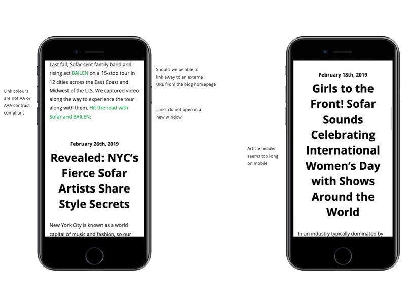
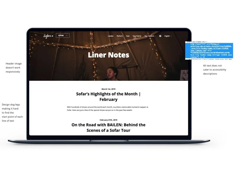
Poor mobile responsiveness led to a frustrating user experience.
Misaligned content that didn’t drive readers to explore further.
Low time on the page, indicating that the design wasn’t engaging enough.
Accessibility challenges, particularly with colour contrast and screen reader compatibility.
We wanted to understand not just how to retain users on the page, but also how to encourage deeper exploration of Sofar’s content ecosystem.
Ideation & Prototyping
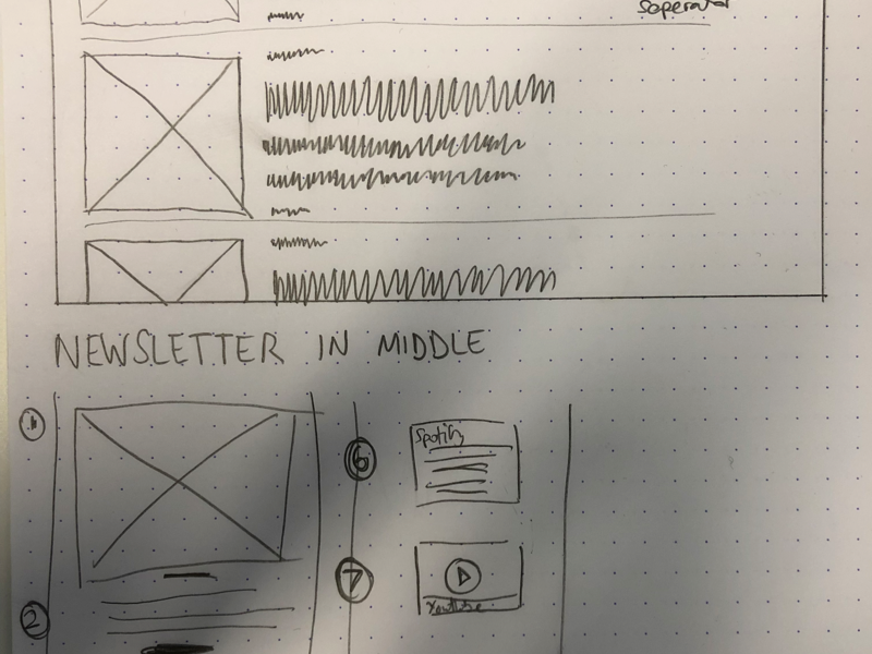
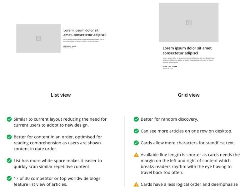
Based on our research, I developed a range of low-fidelity sketches and possible solutions. These were refined through collaboration with stakeholders and engineering. The team prioritized the following design goals:
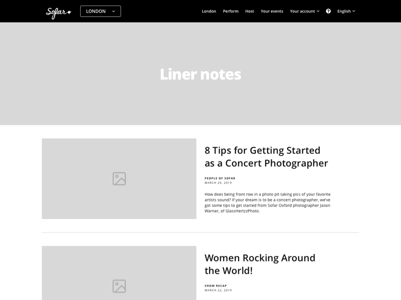
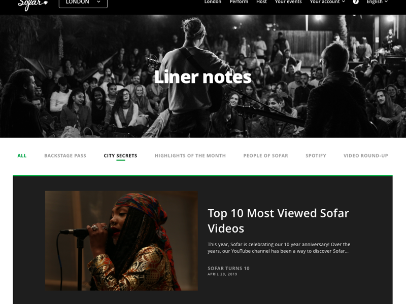
Improve content discovery with a more structured layout.
Enhance accessibility by adhering to modern web standards.
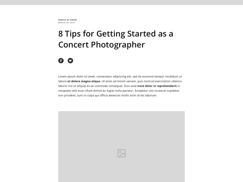
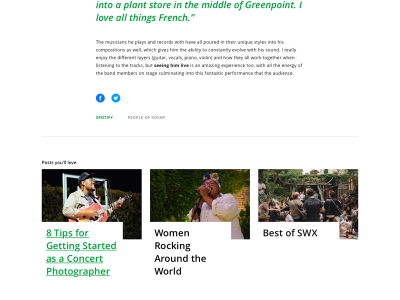
Increase user engagement through multimedia support (videos, playlists, quotes) and social media integration.
I created interactive prototypes of the blog index and article pages, allowing the team to visualize the updated user flows and functionality. This also helped facilitate more meaningful feedback from the Brand and Product teams.
Usability Testing
Once we had a solid set of prototypes, I set up usability testing through Preely, tapping into a group of over 200 Sofar users who had opted into our research program. I crafted a series of test scripts and tasks designed to evaluate:
Content discovery: How easily users could find playlists and articles.
Interaction design: User preferences toward different layout elements.
Ease of use: How quickly users could complete key tasks like signing up for the newsletter or sharing content.
The tests revealed significant improvements in the following areas:
Time on task: Users were able to find content more quickly.
Perceived ease: The new design felt more intuitive and visually engaging.
Accessibility: The design now met accessibility standards, ensuring a better experience for all users.
Iteration & Collaboration
We iterated on the design based on the insights gathered from testing, continuously refining the layout and functionality. Once the designs were final, I worked closely with the Engineers to ensure a smooth handoff via Zeplin, where I provided detailed annotations and assets. We paired frequently during the implementation phase, allowing us to troubleshoot any technical challenges in real time.
Outcomes & Lessons Learned
Key Outcomes:
Improved Engagement: The redesigned pages led to an increase in the number of articles read per session and longer time spent on the page.
Increased Leads: The integration of the newsletter lead capture form significantly boosted sign-ups, creating a valuable growth channel for Sofar.
Reduced Bounce Rates: By improving content discovery and aligning it with user needs, we saw a notable reduction in bounce rates.
Greater Flexibility: The Brand team could now tag articles, add multimedia elements, and integrate social sharing, making the content more engaging and dynamic.
Validated Design System: This project also served as an opportunity to validate Sofar’s new design system, which was crucial as we prepared for an upcoming checkout redesign ahead of the SCA (Strong Customer Authentication) deadline.
Key Learnings:
Content Flexibility Drives Engagement: Giving the Brand team more control over how content is displayed, through features like tagging and multimedia, had a direct impact on user engagement and time on the page.
Cross-functional Collaboration: Continuous collaboration between design, engineering, and brand teams was essential in ensuring that the final product met both user and business goals.
Importance of Accessibility: Adhering to accessibility standards not only broadened the potential audience but also improved the overall usability of the blog for all users.
This project emphasized the importance of aligning content presentation with user needs and ensuring that technical constraints are balanced with UX priorities. The success of the redesign also laid the foundation for future content and checkout-related improvements at Sofar Sounds.
Host & Artist Pages Redesign
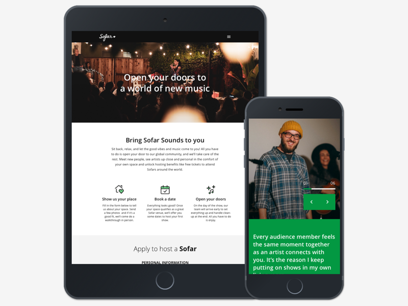
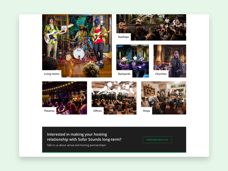
Sofar Sounds hosts hundreds of live events worldwide each month, with many held in unique, intimate venues like people’s homes or local businesses. To facilitate this, Sofar had dedicated web pages for hosts and artists to submit applications, learn about the process, and understand what to expect on the event day. However, these pages were outdated and failed to effectively convey important information or gather high-quality applications. Our goal was to refresh these pages to boost engagement, increase application quality, and clarify the application process.
Problem
The existing Host and Artist pages were outdated both aesthetically and functionally. Not only did they lack modern branding, but they also failed to provide a clear and engaging journey for applicants. Information was sparse, and confusing, and did not adequately explain the benefits or next steps in the application process. Additionally, the forms for submission were poorly designed, leading to incomplete or irrelevant data.
Key Challenges:
Outdated design that failed to align with the Sofar brand.
Limited clarity about the application process and event-day expectations.
Low-quality form submissions, resulting in a higher manual workload for the city operations team.
Long, inaccessible forms that deterred applicants.
Our goal was to improve both the application process for users and the operational efficiency of Sofar staff.
Users & Audience
The users of these pages were musicians looking for performance opportunities and business owners interested in hosting events for exposure. Both groups had varying levels of experience and different needs. Additionally, Sofar staff members worldwide used an internal admin platform to process applications, which we also needed to consider in our design updates.
Roles & Responsibilities
I was the Lead Product Designer on this project, working alongside a Product Manager, Head of Brand, VP of City Operations, and an Engineering team based around the world. I led the end-to-end design process, from research to implementation, while collaborating with key stakeholders to align the project goals with business needs.
Scope & Constraints
The redesign focused on two main pages: the Host and Artist application pages. Both needed to be fully responsive and feature a form for users to submit detailed applications. We also needed to consider the integration with Sofar’s internal admin platform, which staff used to review and process applications. One of the constraints was ensuring that the two pages shared a similar template to reduce development time, with only slight variations between them.
Process
Discovery & Research
The project started with a brief from the Brand team, outlining the need for a refreshed design and a more efficient application process. Following a design thinking approach, I began with competitor and heuristic analyses to understand industry standards and identify gaps in our current pages.
To deepen our insights, I created a discussion guide and interviewed both hosts and artists who had previously applied. Additionally, I used Hotjar and Usability Hub to collect user behaviour data on the existing pages and forms.
Key Findings:
Limited information: Users didn’t have enough clarity about what happens after their application and what to expect on the event day.
Poor form UX: The existing forms were long, hidden sections were confusing, and basic design patterns were not followed, leading to a frustrating experience.
Low-quality assets: Images and other content were outdated, impacting the credibility of the pages.
Ideation & Prototyping
Once the research was complete, I moved into the ideation phase, sketching possible solutions and prioritizing them based on user needs and business goals. I worked on several low-fidelity prototypes, which were reviewed and refined through feedback from stakeholders, including the VP of City Operations and the Engineering team.
Key design goals included:
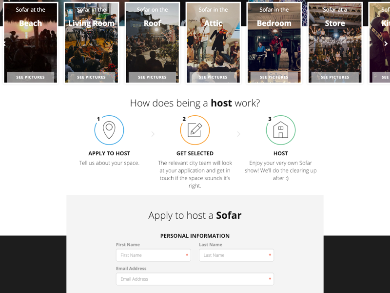
Clearer information hierarchy: Simplify the journey by providing clear, step-by-step instructions about the application process and what happens on the day of the show.
Improved form UX: Shorten the forms, remove hidden sections, and add validation to ensure high-quality data submission.
Modern design: Align the pages with Sofar’s new branding while maintaining a focus on usability and accessibility.
Usability Testing
After creating a couple of prototypes for each page, I conducted several rounds of usability testing using Preely, Marvel, and guerilla testing. The focus of these tests was to evaluate:
Information clarity: How well users understood the application process.
Form usability: Whether users found the forms easy to complete and accessible.
Engagement with content: Did users find the updated design more engaging, and were they more likely to complete the application?
The tests revealed significant improvements in user understanding of the application process, and the simplified forms greatly reduced abandonment rates.
Final Design & Implementation
The final design featured responsive layouts with high-quality assets, improved page hierarchies, and concise, easily digestible information. I collaborated closely with the Engineering team to ensure the pages were efficiently built using shared components from our Design System, reducing development time. We also maintained aspect ratios across various breakpoints to ensure that images and assets looked consistent across devices.
One challenge we encountered during this phase was ensuring that the pages were easy to implement for a Junior Engineer. To address this, we made adjustments during backlog refinement sessions, simplifying certain design elements without compromising the user experience.
Outcomes & Lessons Learned
Key Outcomes:
Increased Conversion Rates: The improved page hierarchy, clearer information, and enhanced form UX led to a significant increase in the number of applications submitted by hosts and artists.
Higher Quality Applications: With the inclusion of form validation and better UX design, we saw a reduction in incomplete or irrelevant applications, streamlining the review process for the city teams.
Improved Operational Efficiency: The redesign reduced manual work for Sofar’s internal teams by improving the quality of data collected through the forms, allowing staff to process applications more efficiently.
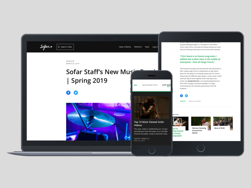
Responsive, Modern Pages: The new pages were fully responsive, featuring high-quality assets and more engaging content that aligned with Sofar’s branding.
Faster Development: By reusing React components from our Design System, we were able to build the pages more quickly, which is especially useful for future updates.
Key Learnings:
Efficiency through Design Systems: Leveraging a consistent design system not only speeds up development but also ensures consistency across different pages and projects.
User-Centered Forms: Simplifying the forms and providing clear, upfront information drastically improved both the user experience and the quality of data collected.
Continuous Iteration: Even after the initial launch, iterating based on user data was crucial. We continued to refine the design post-launch to enhance performance further.
This project demonstrated how thoughtful UX design, backed by research and collaboration, can drive both user engagement and operational efficiency, ultimately helping Sofar Sounds scale its global community.
How it works
Sofar Sounds operates in over 330 cities around the world. With a smaller sample classed as ‘full-time cities’. The process for users worldwide can depend on which location they wish to attend an event. For smaller volunteer cities, they would apply to attend and entered onto the guest list, and on the day of the show, Sofar would encourage ‘hat donations’, with the revenue split between the artists. In our larger and full-time cities, users would apply to a show, and then a guest-list selected via a lottery were then invited to purchase their tickets. Differences between applications and the mystery around them meant the ‘How it Works’ page featured as an FAQ page to educate users on attending a Sofar.
Problem
The pages were very out of date and had previously just gone straight into a build. With so many differences in the ways users could apply for tickets and what they might expect after an application, the page was not clear at all. It did look rushed and was causing some confusion. There was no call to action on the page and nothing to entice the user on acting upon the information they had just learned.
Users & Audience
The users of the pages included attendees from our global community. Sofar never promoted the pages or surfaced paths into the page, and the only method of getting to the page was through organic search and discovery. There were occasional use cases for the page for our brand team when discussing Sofar with the press to give them an overview of Sofar.
Roles & Responsibilities
I was the sole Product Designer, working alongside a Product Manager, an Engineer and a Head of Brand.
Scope & Constraints
Sofar required the page to be fully responsive. The duration of this project was only one week.
Process
Starting as an informal chat between Design, Product and Brand, we explored possible opportunities for the page. A brief then came in from the Brand team. The process followed design thinking and pairing to create a quick solution.
My discovery work consisted of heuristic analysis, competitor analysis, and reviewing existing Hotjar & GA data. I also reached out to our Customer Service team, enquiring about the most common issues customers were facing with the ticketing process.
Problems uncovered included; poor onward conversion, mistrust in the brand, issues with ticket applications and policies. The designs were inaccessible and simply not engaging, nor showed how special one of Sofar’s events might be.
I had enough to start ideating a better solution for the page, starting with sketches, then to wireframes and UI in a good place to begin usability testing. I began corridor & guerilla testing the design, along the way making a few design changes and amendments to the messaging.
Outcomes & Lessons
Before completing the designs, a higher priority project took precedent with the page left in its current state. We did, however, increase collaboration within our team and our efforts to follow a lean approach to generate solutions to potentially low hanging fruit.