Sofar PPC Pages
Sofar Sounds sought to reimagine the live music experience through intimate performances across 330 cities. This project focused on enhancing the Fan Experience and streamlining the paid discovery purchase journey from social media ads, reducing the bounce rate on their PPC (Pay Per Click) landing pages and improving conversions.
Date: Q1 2020 - Q4 2020
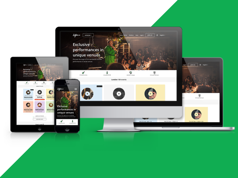
PPC City Page
Problem
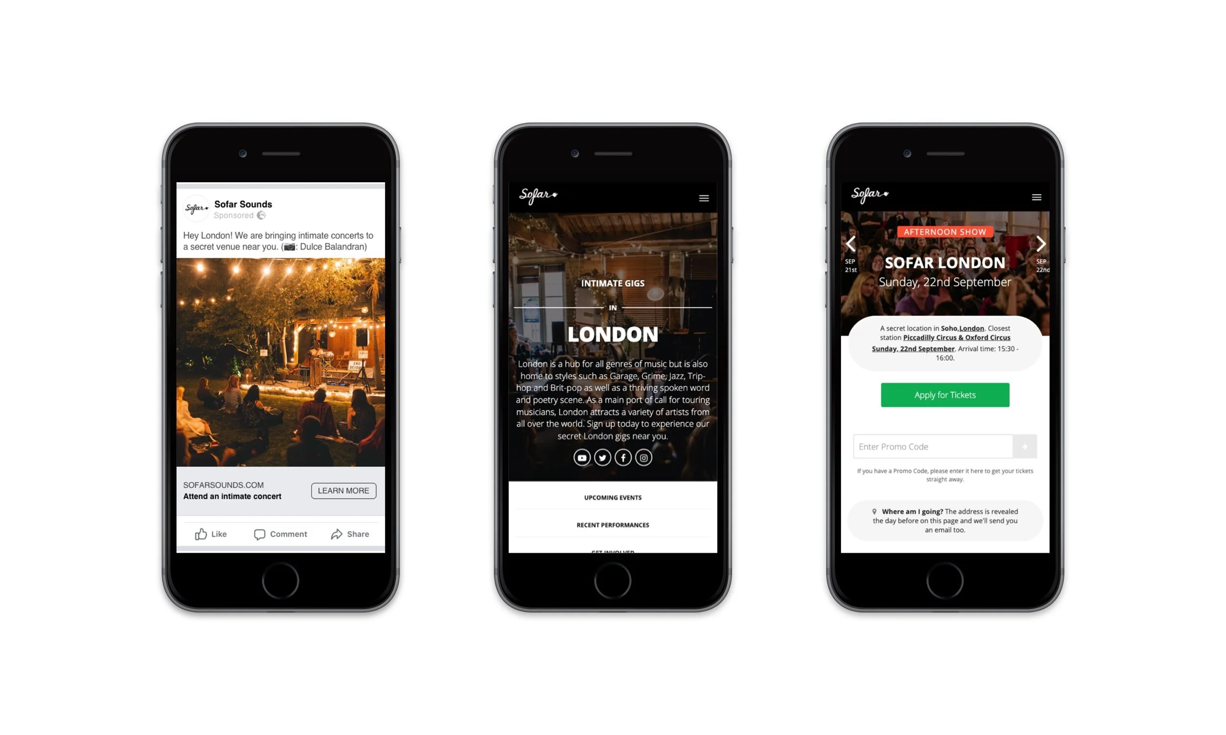
The primary goal was to reduce the high bounce rate of the Product Listing Pages (PLPs), which users landed on after clicking social media ads (Instagram and Facebook). The team aimed to increase account creation from 4.9% to 8% and move more users through the funnel to purchase tickets in major cities like London, New York, and Chicago.
Users & Audience
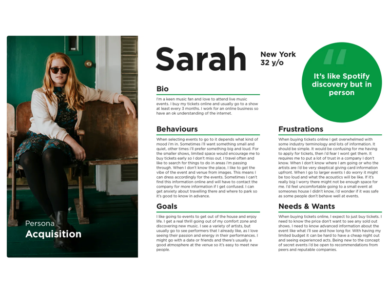
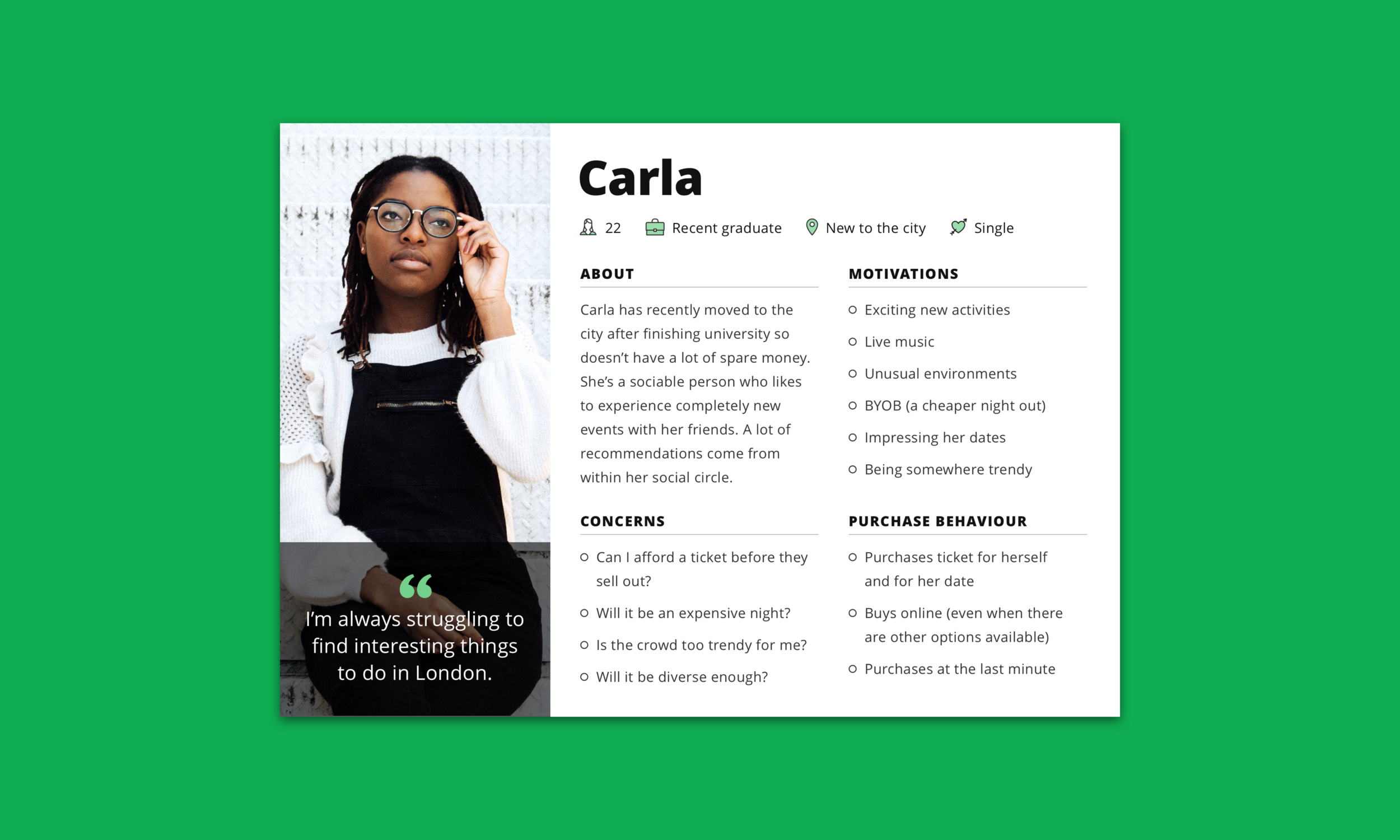
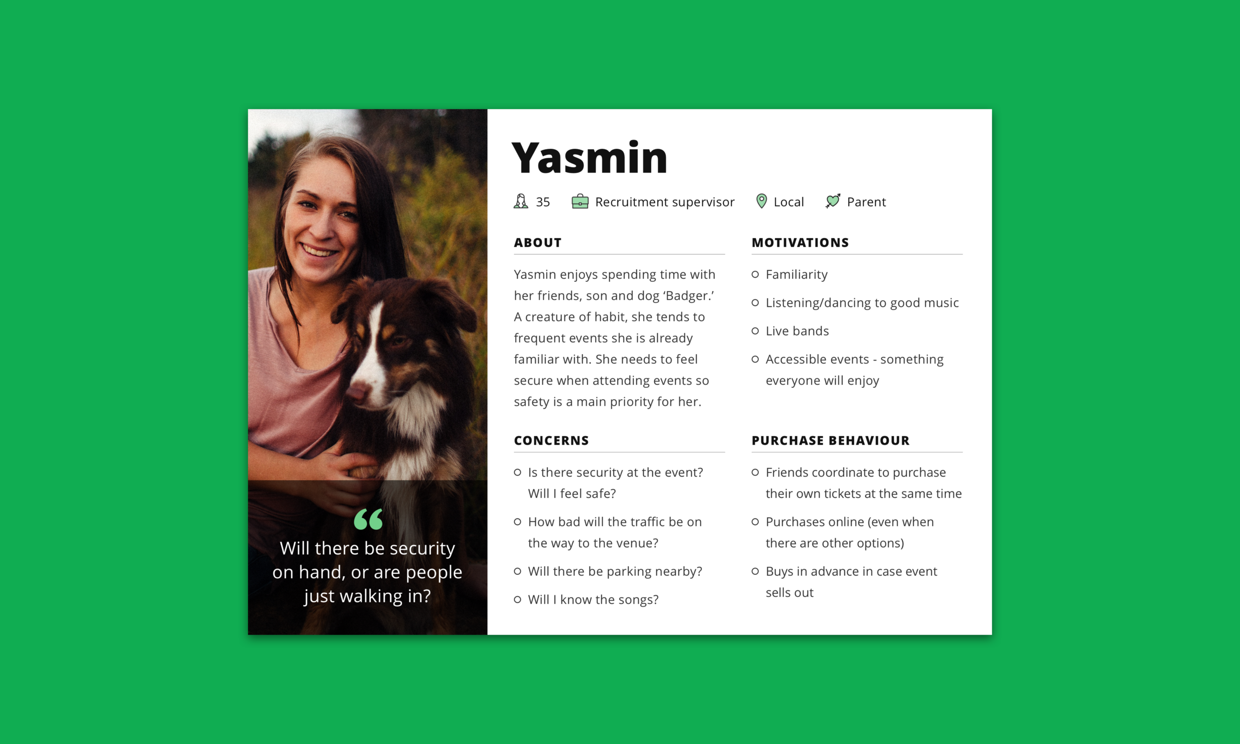
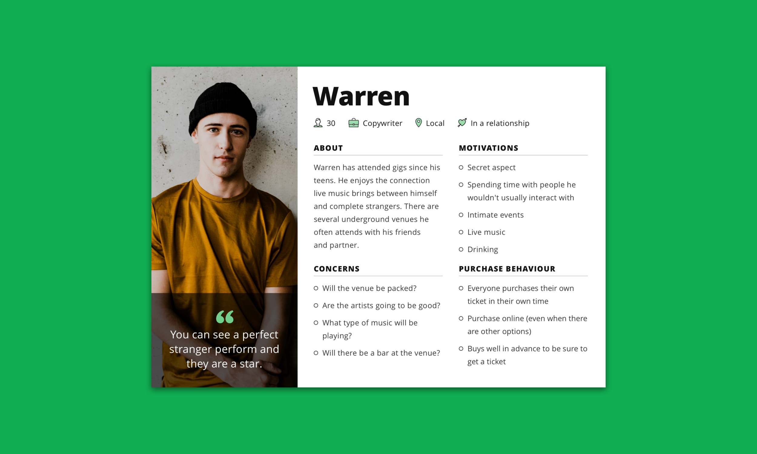
The users were mainly live music fans who encountered Sofar's ads on social platforms and landed on city-specific PPC pages. Personas varied from music lovers discovering intimate performances to those booking tickets for secret live shows. Stakeholders also included brand partnerships, hosts, businesses, and performing artists.
Roles & Responsibilities
I led the Product Design efforts within the Fan Experience squad, consisting of a Researcher, another Product Designer, a Product Manager, and six Engineers. We collaborated with various stakeholders including members of the Data, Brand, and Growth teams.
Scope & Constraints
The scope involved the full-time city PPC PLP landing pages and was limited to three months. The project required a mobile-first, fully responsive design and adherence to the Bootstrap 4 layout grid. Our team was in the midst of migrating to a new tech stack, and we also utilized Google Optimize for A/B testing.
Process
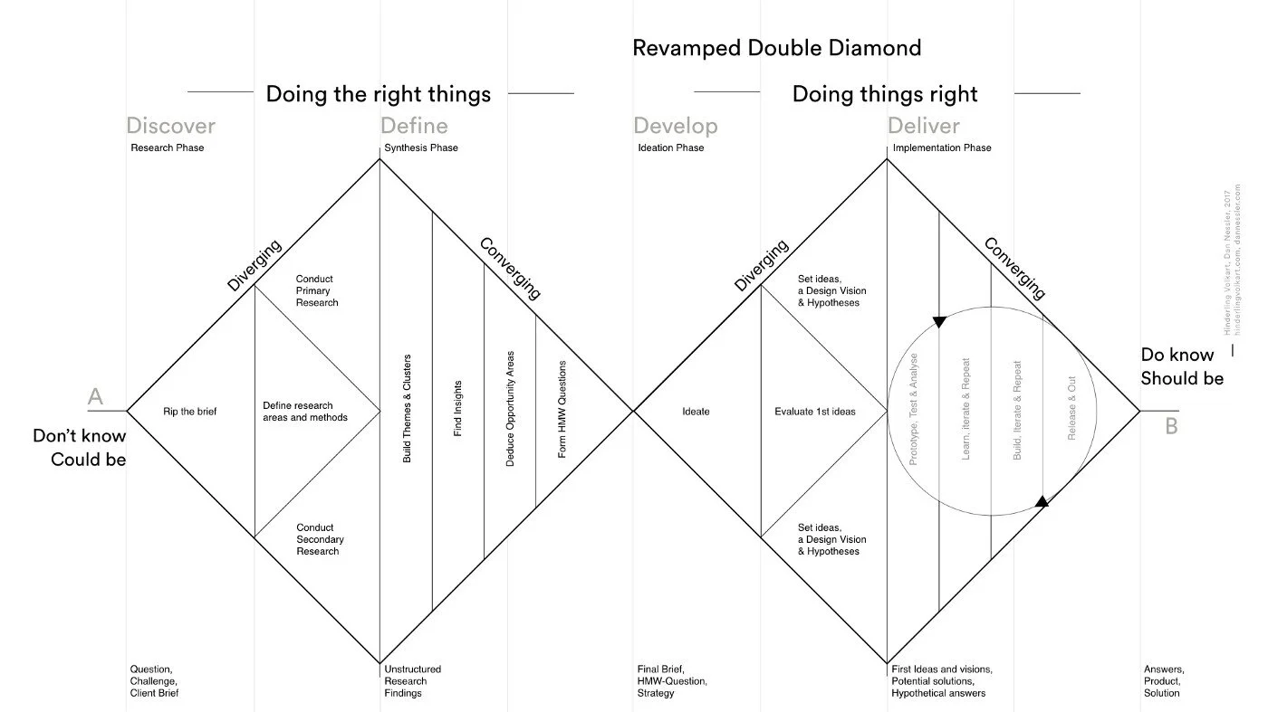
We used the Double Diamond framework, progressing through the stages of Discover, Define, Develop, and Deliver. We held daily stand-ups, retrospectives, and design critiques to ensure regular collaboration.
Discover
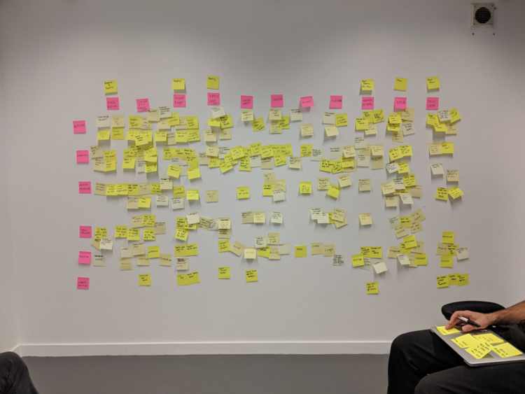
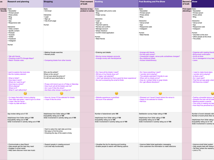
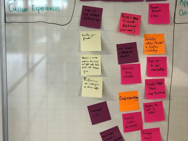
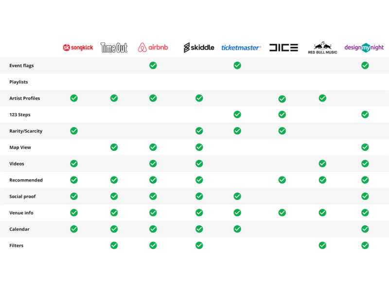
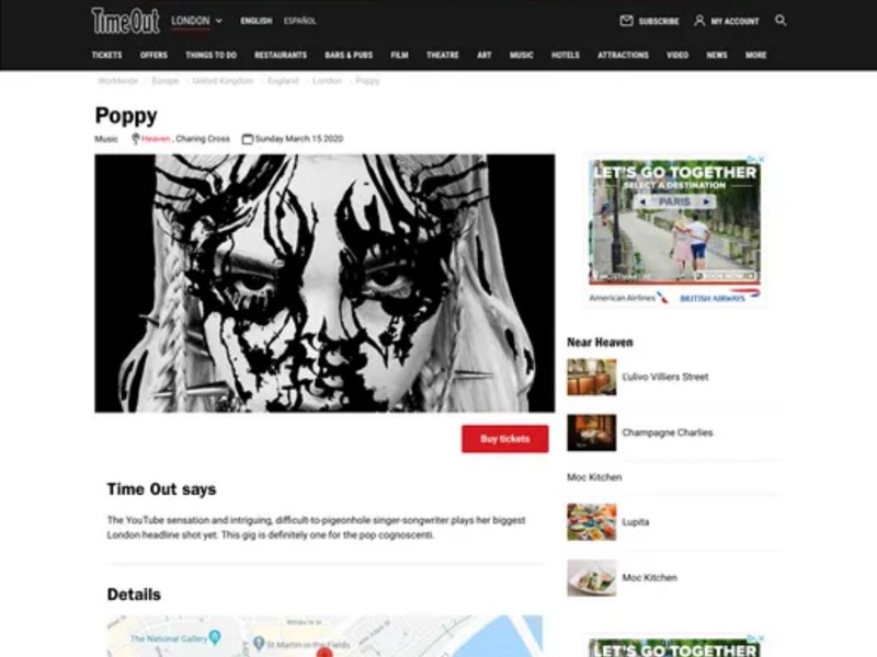
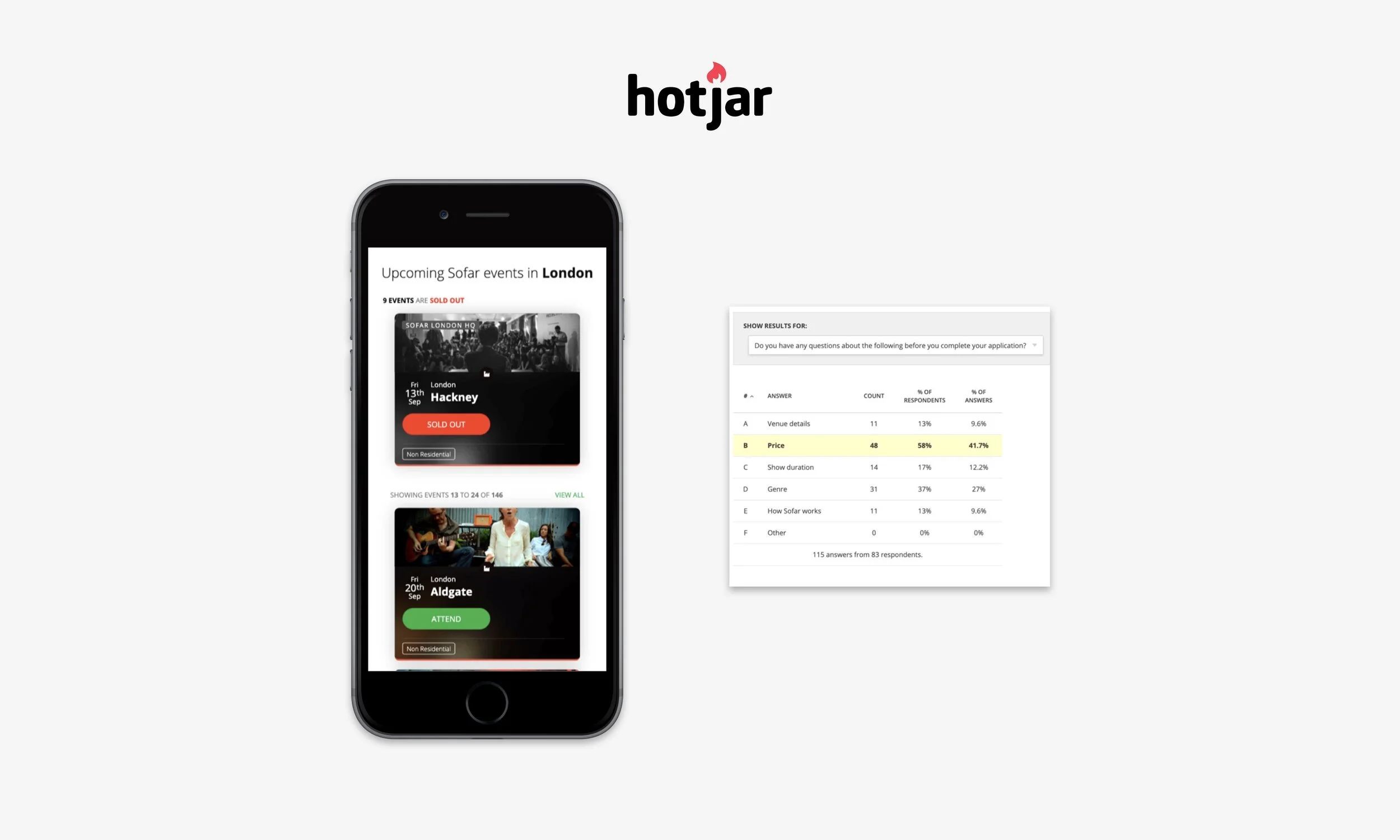
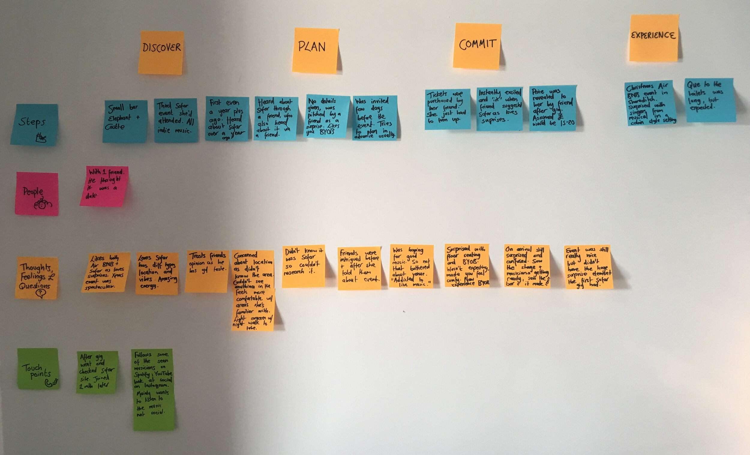
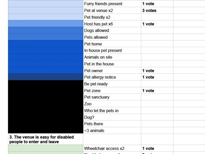
We started by gathering insights from existing user research, including user journey maps, flows, usability tests, Hotjar & GA data, and heuristic analysis. Competitor benchmarking and heuristic analysis helped us understand the issues and compare experiences. Additionally, I assisted with internal card sorting workshops and interviews, compiling data into affinity and empathy maps.
Key findings:
Genre Confusion: Users were unsure about who would perform or what genre they’d hear at events.
Concept Confusion: Users didn’t fully understand Sofar’s value proposition or how to get tickets.
Trust Issues: Many users didn’t know Sofar or whether it was a secure, trustworthy platform.
Event Overwhelm: Some users felt overwhelmed by the number of events and struggled to differentiate between them.
Inclusivity Issues: Certain participants didn’t resonate with the brand’s imagery or messaging.

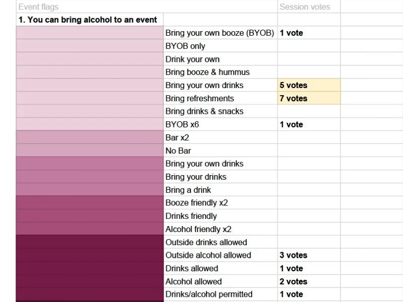
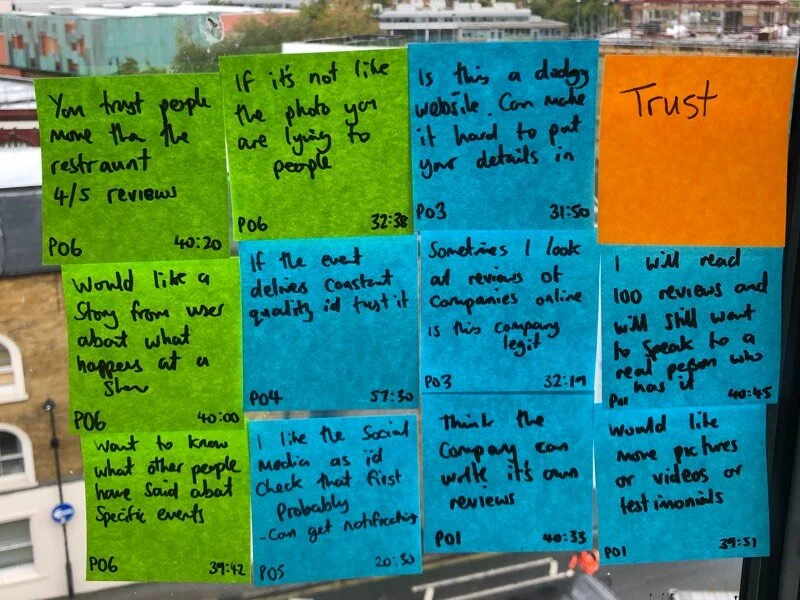
Define
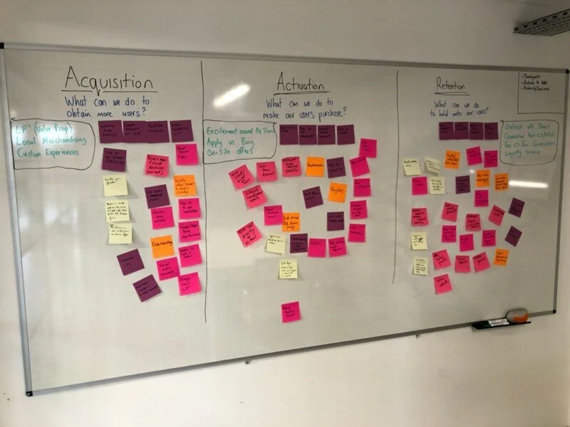
We synthesized the research into refined proto-personas, user journey maps, and a funnel matrix. Key themes included confusion about genres, trust concerns, and event selection. We formed "How Might We" statements to address these themes, such as:
How might we explain what genres users will hear at a Sofar Sounds show?
How might we show more information about the events and venues?
Develop
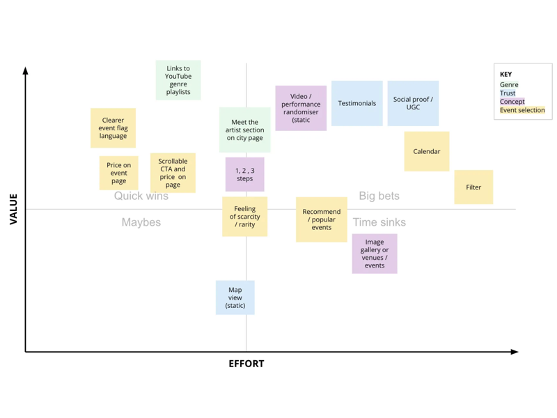
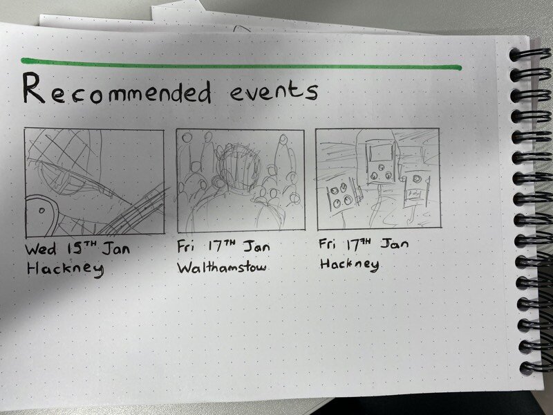
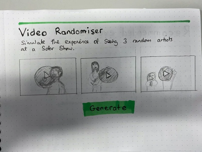
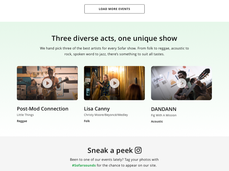
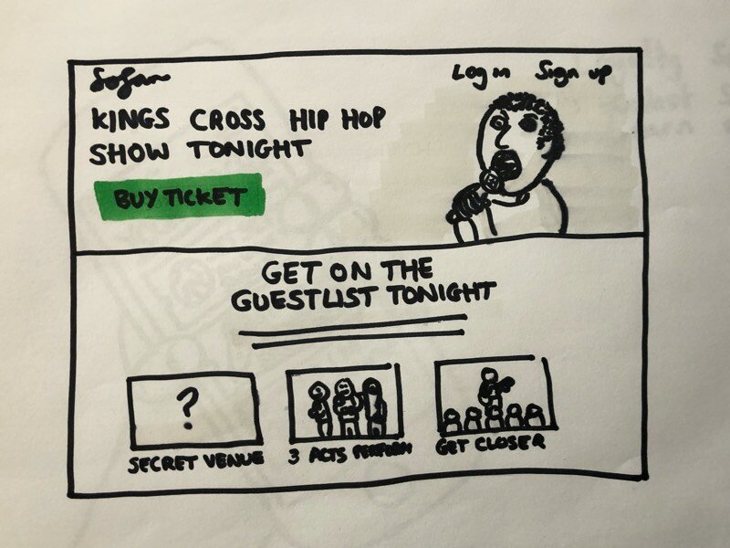
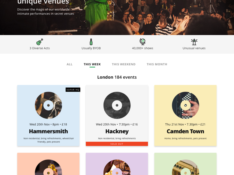
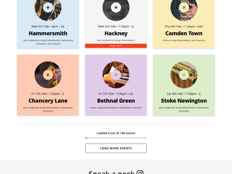
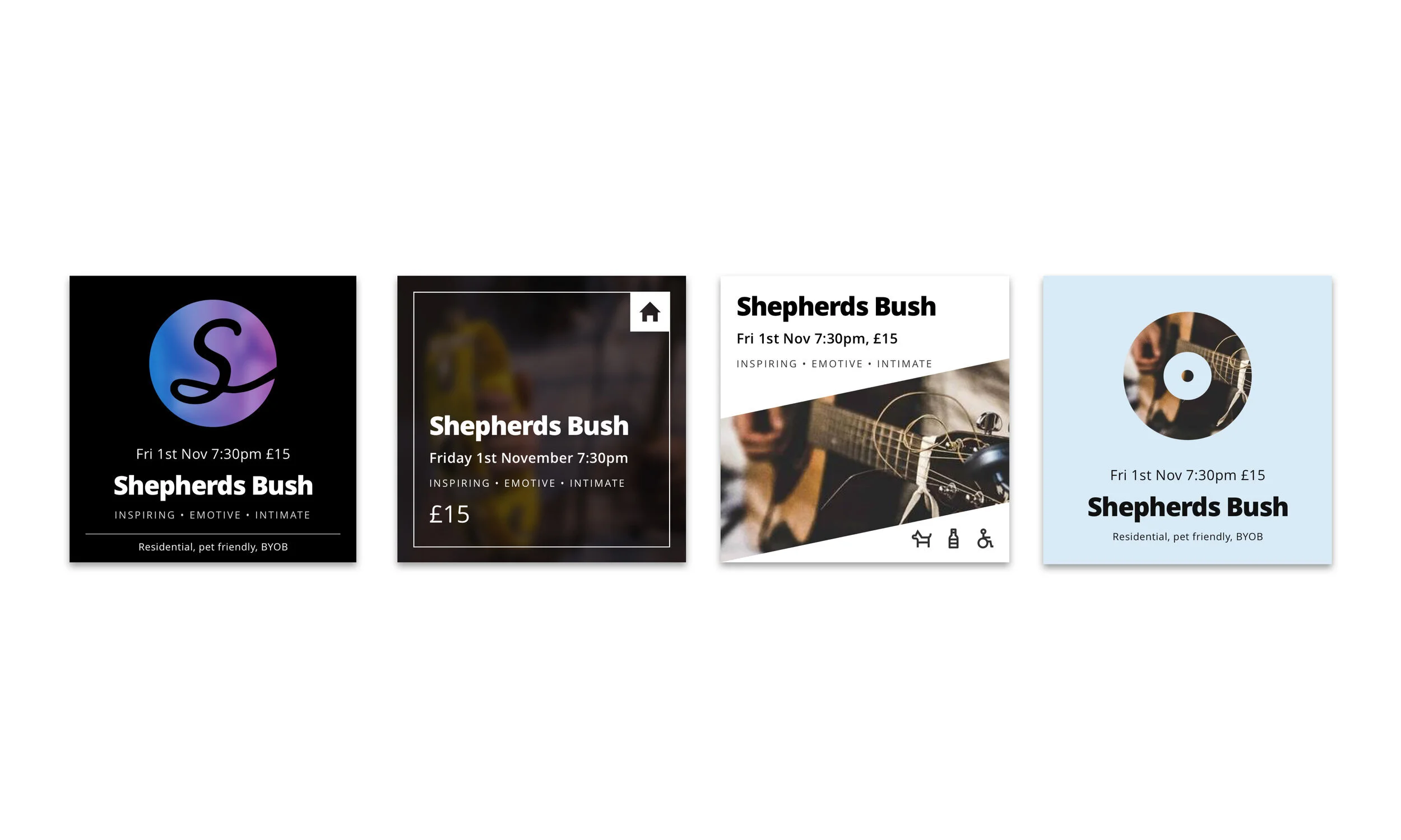
We held several ideation sessions, including Crazy 8s, to explore potential solutions. Through critique and feasibility analysis, we prioritized features using a matrix aligned with effort and perceived value. Prototypes were developed for testing hypotheses, such as:
Sticky CTAs on event pages
Event page pricing
Improved filtering options
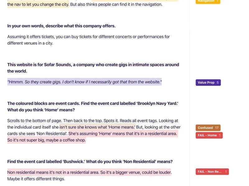
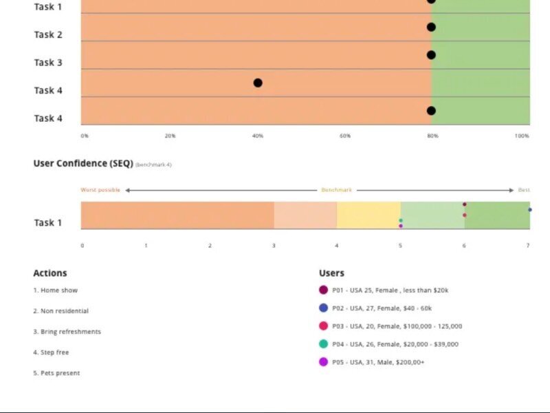
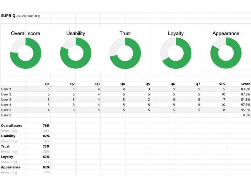
With these prototypes, we conducted A/B tests and usability tests, refining the designs based on user feedback. We introduced additional UX metrics, such as task success rate and task ease, to complement our testing efforts.
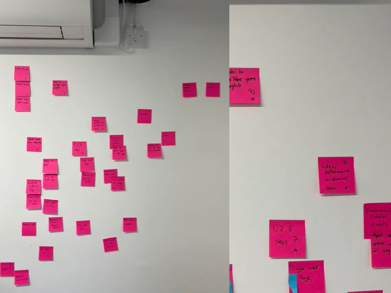
Deliver
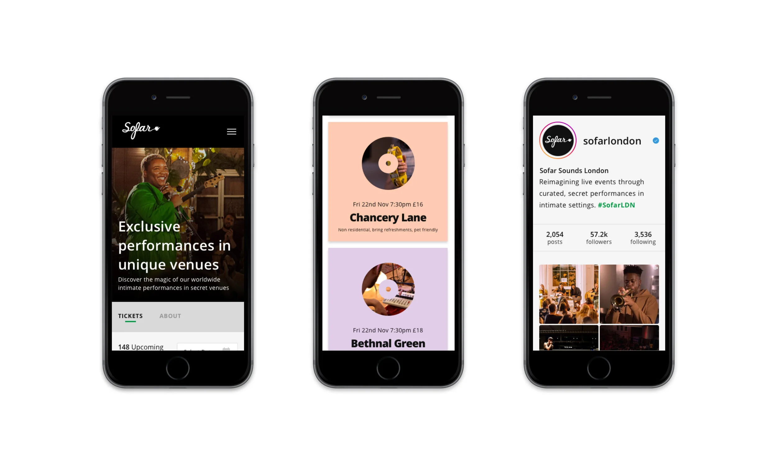
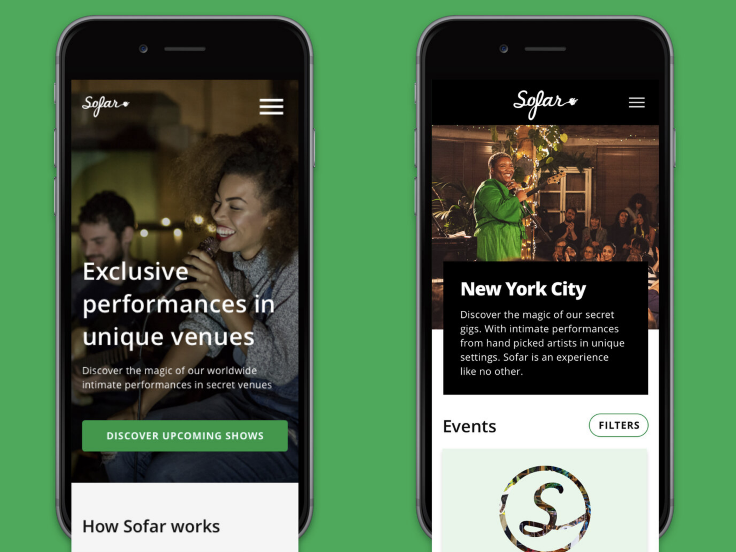
After several iterations, we finalized responsive designs addressing usability issues on the PPC pages. The design files were uploaded to Zeplin for developers, and we collaborated closely to ensure smooth implementation. The A/B tests showed positive results, and we prepared to launch the project just before the holiday break.

Outcome & Lessons
The project exceeded expectations, achieving a 13% increase in conversion rate and a 41% increase in activation rate. We also gained valuable insights into user concerns, particularly around venue safety and security—an issue that female users often flagged.
Lessons Learned
Earlier Prototyping: We would have benefitted from rapid prototyping earlier in the process, as reliance on external recruitment agencies delayed our timeline.
More Time on Problem Definition: Spending more time in the problem-definition phase would have provided a stronger foundation before moving into design and development.
This project reinforced the importance of thorough user research, rapid prototyping, and collaboration across departments to achieve optimal results.
PPC Event Page Redesign
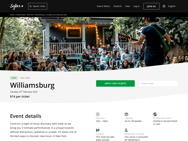
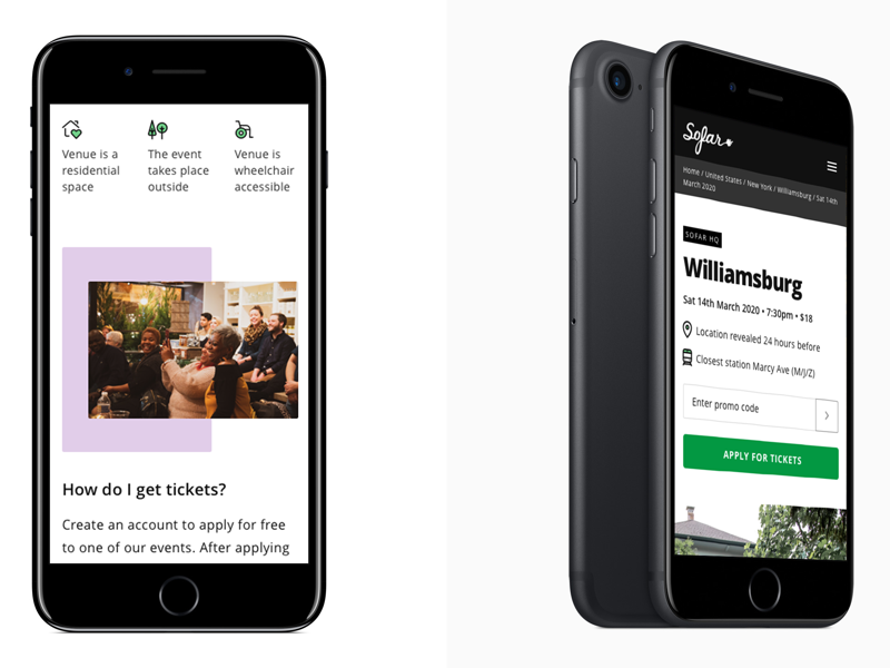
At Sofar Sounds, users typically go through a multi-step journey to apply for or purchase tickets to intimate live events. However, the event pages — a key touchpoint — were outdated and lacked crucial information. My team was tasked with revamping these event pages to enhance the user experience and increase engagement.
Problem
The event pages followed an old template design used globally, but they didn’t provide users with any new or detailed information beyond what was already displayed on the PLP (Product Listing Page). These pages often confused users, especially since many were unsure about who would perform, the duration of the shows, and other specific event details. This confusion led to a high bounce rate and missed opportunities for conversion.
The old design also suffered from a lack of clarity, poor information hierarchy, and accessibility issues. The challenge was to transform these pages into a more engaging, informative, and user-friendly experience.
Roles & Responsibilities
As the Lead Product Designer, I collaborated with another Product Designer, a Product Manager, and several Engineers. We also worked closely with stakeholders from the Growth and Brand teams. My responsibilities included leading the design process, conducting user research, prototyping, and overseeing usability testing, all while working remotely between New York and London.
Scope & Constraints
Our team worked in 2-week sprints following a design thinking approach. I was often working from New York, researching another market in person. This added logistical constraints, such as early morning calls with our remote team and working from unconventional spaces like stairwells and coffee shops. Time zone differences were both a challenge and an advantage, allowing us to collaborate across time zones for greater efficiency.
Process
Discovery
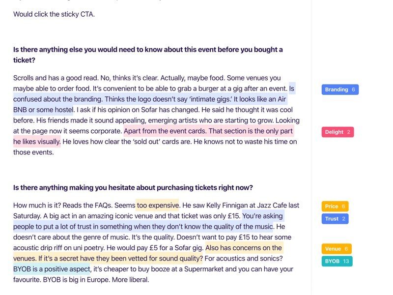
We kicked off by evaluating existing research and data. We knew from previous Hotjar polls that users were confused about Sofar’s value proposition and the music genres featured at events. To dig deeper, we asked users additional questions:
Do you have any questions about the type of music or artists you’ll see at this show?
(Free-type response)Would knowing any of the following encourage you to buy tickets?
When I’ll find out who is playing: 82%
Performance durations: 27%
How the artists are selected: 27%
Seeing other Sofar artist performances: 18%
Number of artists I’ll see: 9%
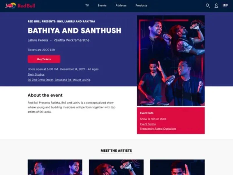
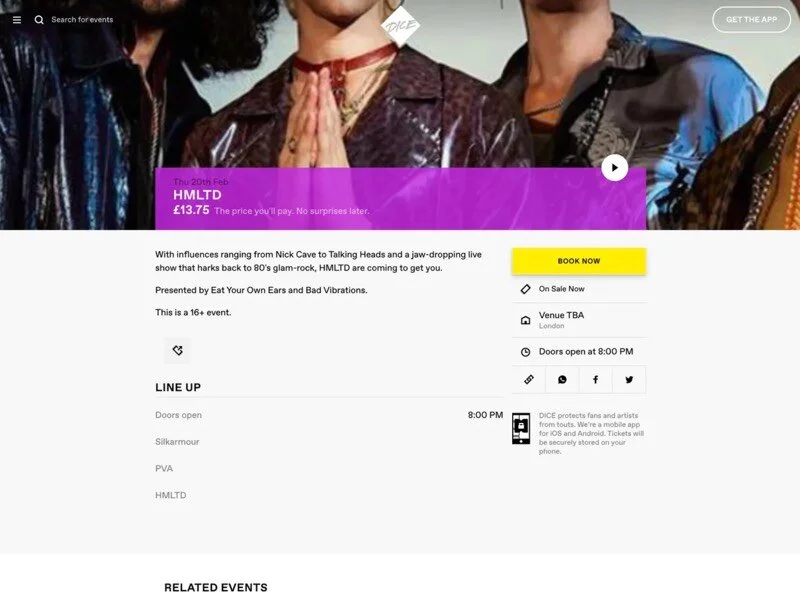
We also conducted heuristic and competitor analyses of event pages and gathered insights from customer support regarding the most frequent issues. Hotjar and Google Analytics data helped further validate our assumptions.
Research Findings
From our research, we discovered that users were:
Overwhelmed by the current content.
Confused about the ticketing and event application processes.
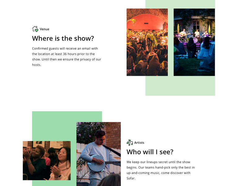
Frustrated by the lack of specific information like artist lineups and venue details.
We also found the design felt out-of-step with other ticketing experiences, leading to a mismatch between user expectations and the brand experience.
Ideation & Low Fidelity Prototyping
Working with the Product Designer, we developed low-fidelity mockups. We then conducted guerrilla testing, collecting feedback on both the current and proposed designs. The results confirmed that users needed more structured information and clearer guidance.
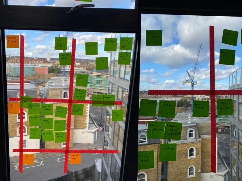
Before diving deeper into design, I facilitated a Red Routes exercise with our Product Manager, Designer, and Researcher to prioritize the critical design paths for the event page. This exercise provided the foundation for our Information Architecture (IA) and guided our efforts toward improving usability.
Design & Testing
In collaboration with the Product Manager, we sketched multiple design ideas and iterated on them until we had a solid solution. The design process was an iterative one, involving several rounds of refinement based on user feedback and stakeholder input.
To validate our design hypotheses, I wrote a test script and worked with the Insights team to launch remote usability tests via usertesting.com. We secured a budget for four rounds of remote testing with 5 participants each, allowing us to test with both in-person users (our core demographic in New York) and remote participants.
Key improvements in the design included:
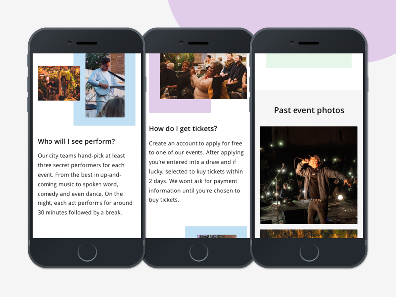
Enhanced imagery that showcased diversity, genre, and hints about venue type.
Clearer explanations of Sofar’s unique ticketing process.
Chunked information with a better layout for easier digestion of event details.
Additional event information, including venue capacity and more specific event details.
Design Iteration & Cross-Time Zone Collaboration
Despite working remotely, we were able to iterate quickly, leveraging time zone differences to maintain momentum. I collaborated with the Product Designer across different time zones to refine designs, making adjustments based on usability feedback and ensuring alignment with the rest of the team.
Outcome & Lessons Learned
With the final designs uploaded into Zeplin, we were ready for implementation. Unfortunately, the project came to a temporary halt due to the onset of the Coronavirus pandemic, delaying deployment. However, the redesign has since been rolled out.
Key Outcomes:
Clarity & Engagement: The redesign addressed the core user pain points of confusion and information overload. Users now had clearer pathways to understanding event details, which improved engagement and reduced frustration.
User-Focused Design: The new layout better reflected the needs and expectations of users, offering essential information like artist details, venue information, and ticketing transparency.
Key Learnings:
Remote Work Efficiency: Working across time zones posed challenges but also allowed us to operate more efficiently, with one team always advancing the project.
Importance of Prototyping Early: Early guerrilla research and prototyping gave us valuable user insights that shaped the final design. Testing earlier in the process would have saved us time in the long run.
User-Centric Information Architecture: By chunking content and prioritizing information that users cared about most, we could significantly improve the event page’s usability and relevance.
This project reinforced the importance of thorough research, iterative design, and prioritizing critical user needs to achieve meaningful improvements in user experience.